


Located in a historic district within the City of Fremont, California, Fremont Springs Conference Center is a modern facility for churches to conduct conferences and regional events. After the property was purchased and renovations to the existing building were nearing completion, they recognized the need for a logo and identity to represent the center. Fremont Springs partnered with Eric Axelson Studio to develop a visual identity system to help the facility come alive.
The visual identity was thoughtfully crafted after extensive research into the history of the City of Fremont, particularly the Warm Springs district. We soon discovered that it was once home to renowned hot springs, which quickly became the conference center’s theme. In the 1800s, many flocked to the springs to bathe in the healing waters to find rest and relief. Our hope was that the center would also carry the same sentiment.
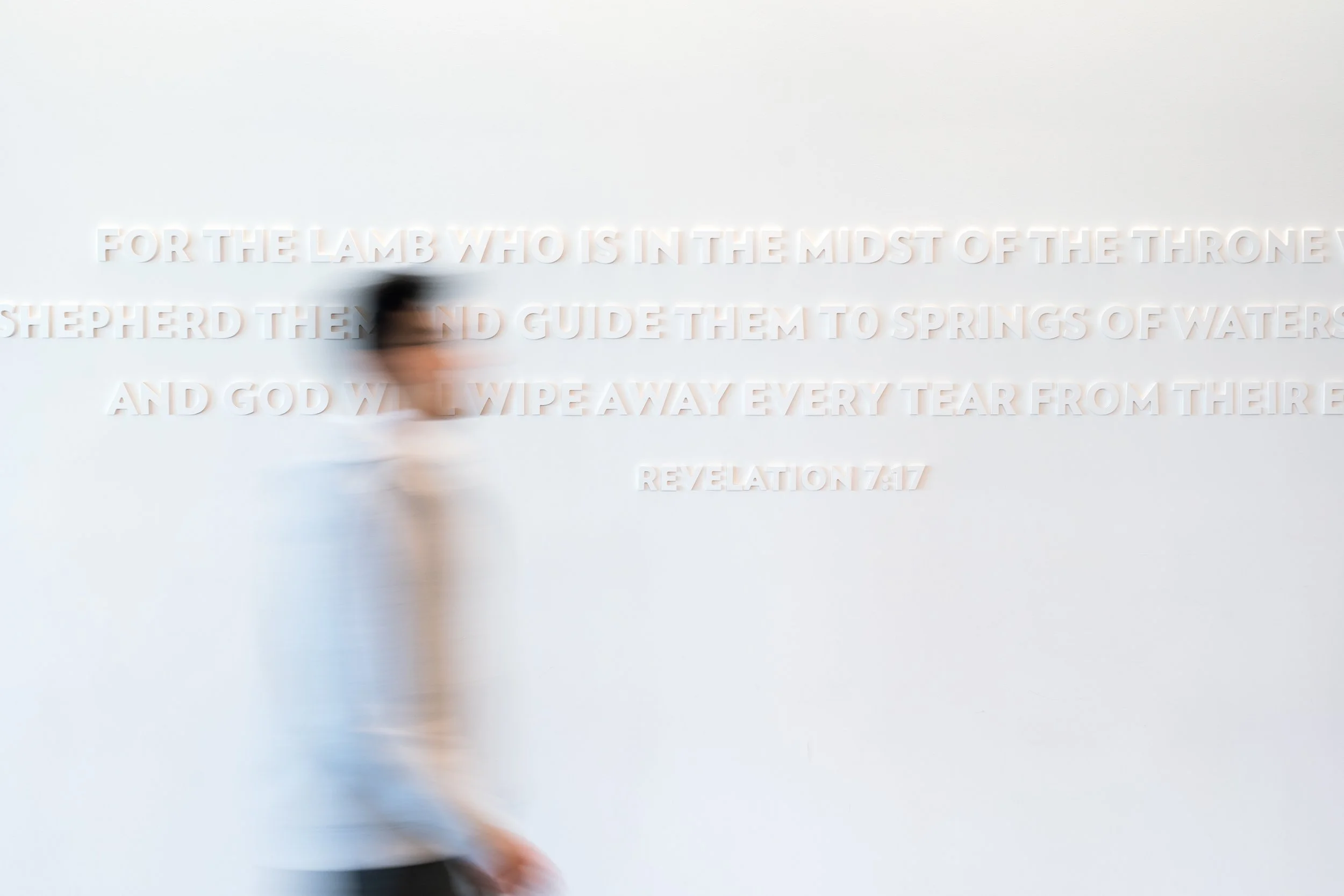
Springs are also significant in the Bible and are used as a metaphor to represent salvation, satisfaction, and refreshment. John 4:14 says, “But whoever drinks of the water that I will give him shall by no means thirst forever, but the water that I will give him will become in him a fountain of water springing up into eternal life.” With all of this before us, we knew this would be an integral part of the center’s visual identity.
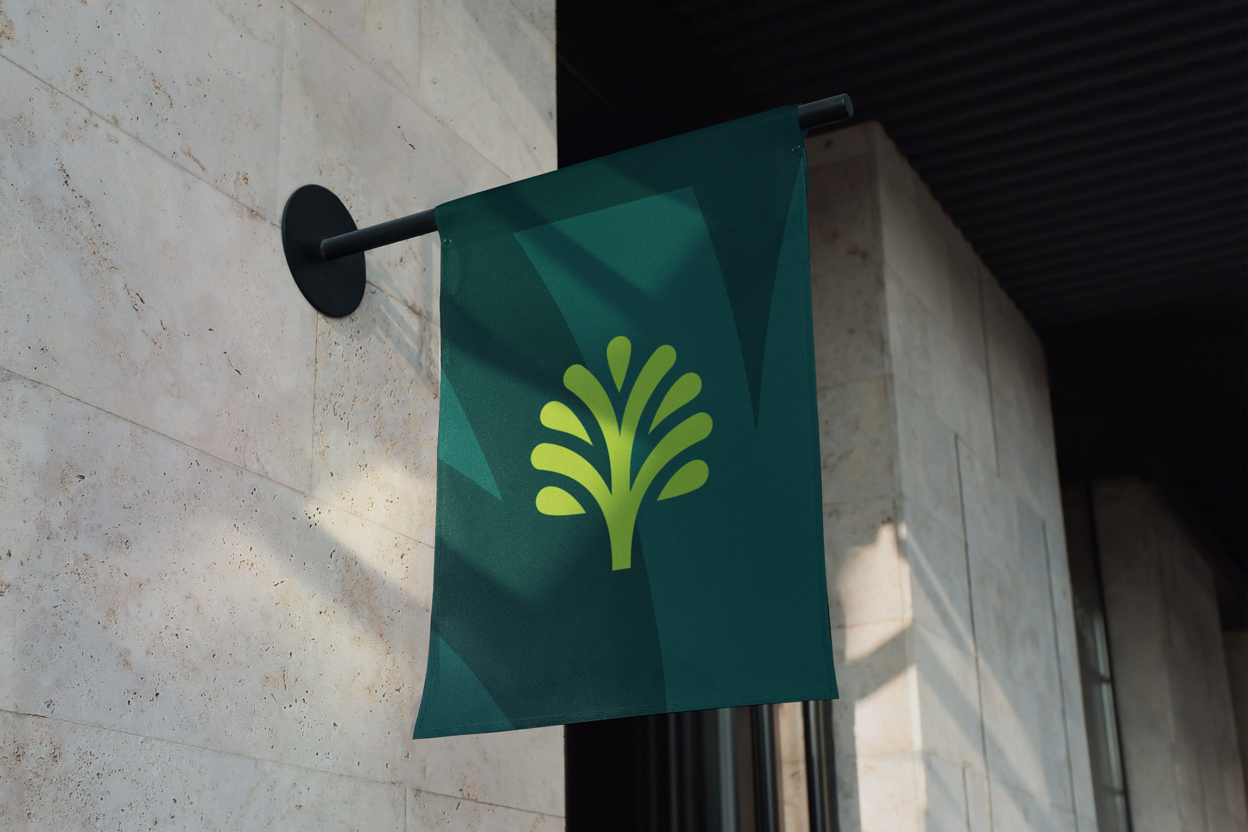
In addition, we found that some of the city’s most important landmarks are trees cultivated by its early pioneers, including the olive trees that lived near the conference center. These trees provide a rich heritage and a vital link to the city’s past. They reference a point in time, especially for the younger generation, on “where we’ve been, where we are, and where we’re going.” Today, these trees play a significant role in providing and maintaining a future identity with the community, making it an appropriate and fitting direction for the logo.
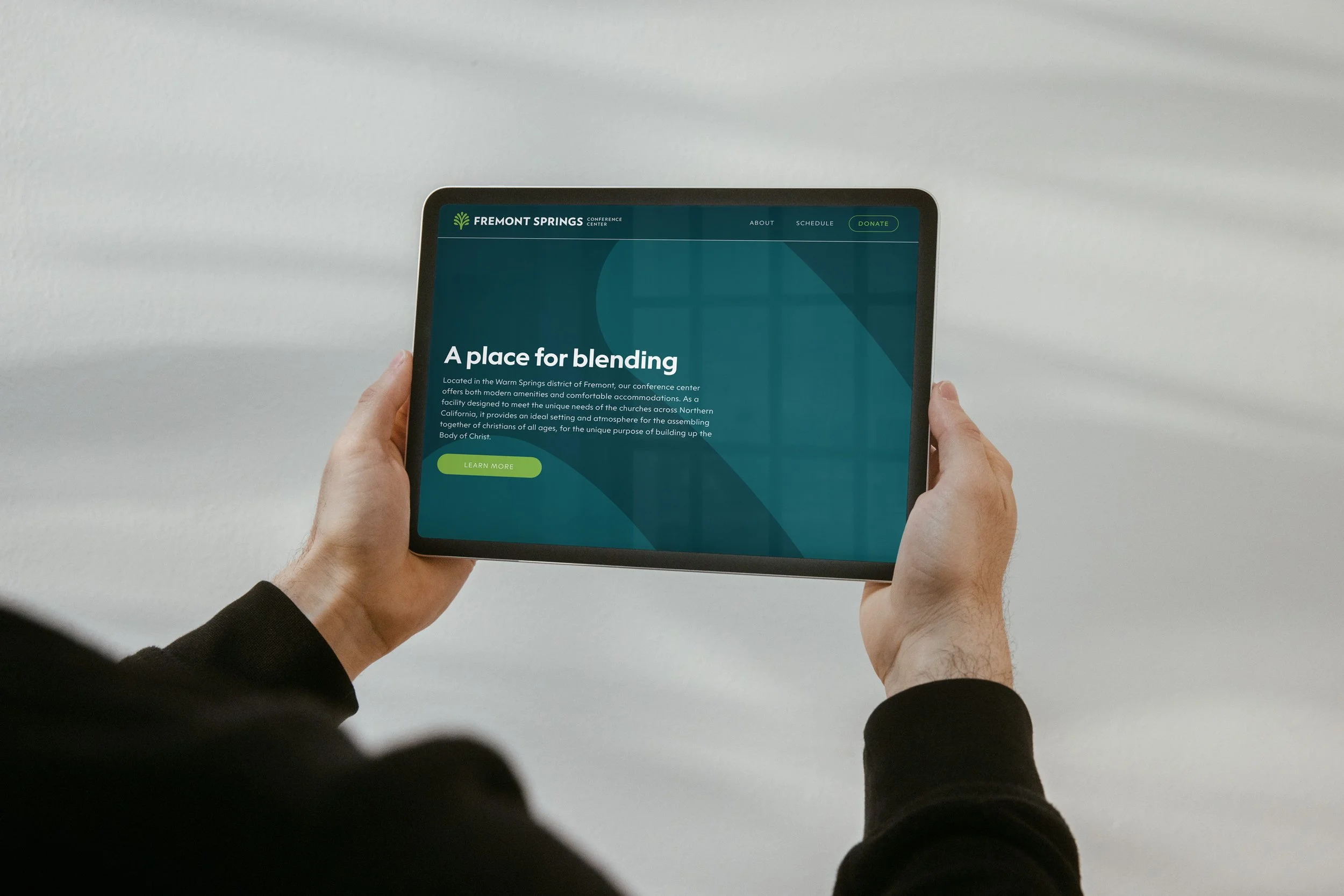
After hundreds of sketches, we landed on a simple yet iconic design concept that pointed to the name — a tree representing the City of Fremont and the depiction of water portraying a spring.
The color palette was derived from actual images of springs. The aqua and teal colors portray its living waters, and the different shades of green represent the abundant life around it. We also extracted a set of neutral grays from the marbled tiles that live on the exterior entranceway used for both the exterior and interior of the building. Since olive trees are one of the city’s essential landmarks and live close to the facility, they were used as a reference when choosing darker shades of green.
To further unify the visual identity, we developed brand guidelines that touched on the personality and visual expression of the brand. It includes guidance on logo usage, typography, color, iconography, and more.
We also developed brand devices to provide consistency to our designs while offering variety. This first device uses the logomark as a backdrop or super graphic to create elegant and ever-changing design compositions. Our second brand device uses watercolor paint to strengthen the visual identity and its relationship to water and springs.
The new identity has helped reinforce the conference center's sense of place within the community of Fremont and its integration of local history and spiritual significance has made a deeper connection with its visitors. Since its release, the mark has been featured in a 2025 Logo Trend Report by LogoLounge, an annual report that explores evolving trends in logo design. It was also featured in Fonts In Use, a respected archive of real-world typographic applications.